首先感谢王红元老师的vue课程,从中受益良多。特别是在目录结构的划分、组件封装思想上受到了很大启发,下面为大家带来一个tabBar的组件封装。
一、创建一个存放公共组件的文件夹,里面再新建一个tabbar的文件夹。里面创建两个.vue文件:TabBar.vue和TabBarItem.vue 如图: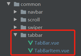
1、TabBar.vue代码展示:
<template> <div class="tab-bar"> <slot></slot> </div> </template> <script> export default { name: "TabBar" } </script> <style scoped> .tab-bar{ width:100%; height: 49px; position: fixed; bottom: 0; left: 0; z-index: 500; display: flex; justify-content: space-around; background-color: white; border-top: 1px solid #f3f3f3 } </style> 2、TabBarItem.vue代码展示:
<template> <div class="tab-bar-item" :style="{color: defaultColor}" @click="itemBind"> <div v-if="!isActive"> <slot name="item-icon"></slot> </div> <div v-else> <slot name="item-icon-active"></slot> </div> <div :style="activeStyle"> <slot name="item-text"></slot> </div> </div> </template> <script> export default { name: "TabBarItem", computed:{ isActive(){ //激活当前路由对应的tab项样式 return this.$route.path.indexOf(this.path) != -1 }, activeStyle(){ return this.isActive?{color:this.activeColor}:{} } }, props:{ path:{ type:String, default:'/' }, activeColor: { type:String, default: '#f96702' }, defaultColor:{ type: String, default: '#666' } }, methods:{ itemBind(){ //点击tabBar项跳转对应的路由 if(!this.isActive){ this.$router.replace(this.path) } } } } </script> <style scoped> .tab-bar-item{ position: relative; display: flex; flex-direction: column; justify-content: center; align-items: center; font-size: 13px } .tab-bar-item img{ display: block; width: 25px; height: 25px; margin-bottom: 2px; } </style> 二、创建一个MainTabBar.vue文件,用于导入上述组件,以及配置tabBar相关参数。代码展示:
<template> <tab-bar v-if="isShowTabbar"> <tab-bar-item v-for="item in tabBarArr" :path="item.path" :activeColor="activeColor" :defaultColor="defaultColor" > <template v-slot:item-icon> <img :src="item.defaultIcon"> </template> <template v-slot:item-icon-active> <img :src="item.activeIcon"> </template> <template v-slot:item-text> <div>{{item.name}}</div> </template> </tab-bar-item> </tab-bar> </template> <script> import TabBar from 'components/common/tabbar/TabBar' import TabBarItem from 'components/common/tabbar/TabBarItem' export default { name: "MainTabBar", components:{ TabBar,TabBarItem }, data(){ return{ activeColor:'#008cd6', //选中色 defaultColor:'#8a8a8a', //默认色 tabBarArr:[ { path:'/storelist', name:'加油闪付', defaultIcon:require('assets/img/tabbar/flashPay.png'), activeIcon:require('assets/img/tabbar/flashPayChoosed.png') }, { path:'/equity', name:'车主权益', defaultIcon:require('assets/img/tabbar/equity.png'), activeIcon:require('assets/img/tabbar/equityChoosed.png') }, { path:'/gasstation', name:'油站导航', defaultIcon:require('assets/img/tabbar/navigation.png'), activeIcon:require('assets/img/tabbar/navigationChoosed.png') }, { path:'/profile', name:'个人中心', defaultIcon:require('assets/img/tabbar/customerCenter.png'), activeIcon:require('assets/img/tabbar/customerCenterChoosed.png') } ] } }, computed:{ // 控制非tab页隐藏tab导航 isShowTabbar(){ return this.tabBarArr.map(val=>{return val['path']}).includes(this.$route.path) } } } </script> 三、导入组件
在App.vue文件中导入MainTabBar.vue组件;
然后调用即可;
至此tabBar的底部导航组件封装完成;
达到的功能:可配置默认色、激活色、图标、路由。